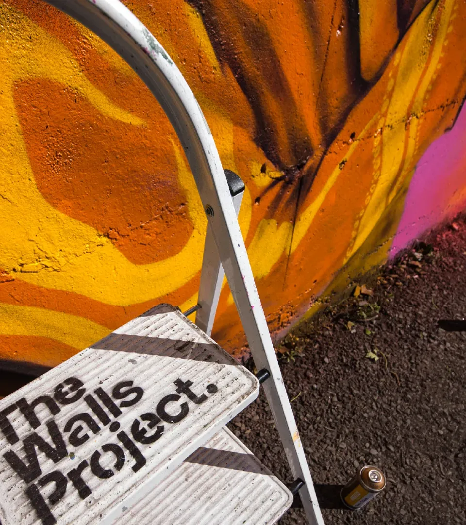
More Like This
The Walls Project came to us in need of a brave and bold identity to bring the organisation behind the Waterford Walls Festival into the big picture. The challenge for us was to establish a cohesive brand family that reflected the organisation’s confident leadership position in the field. As a socially motivated organisation, it was really important that their core values were reflected in the brand.
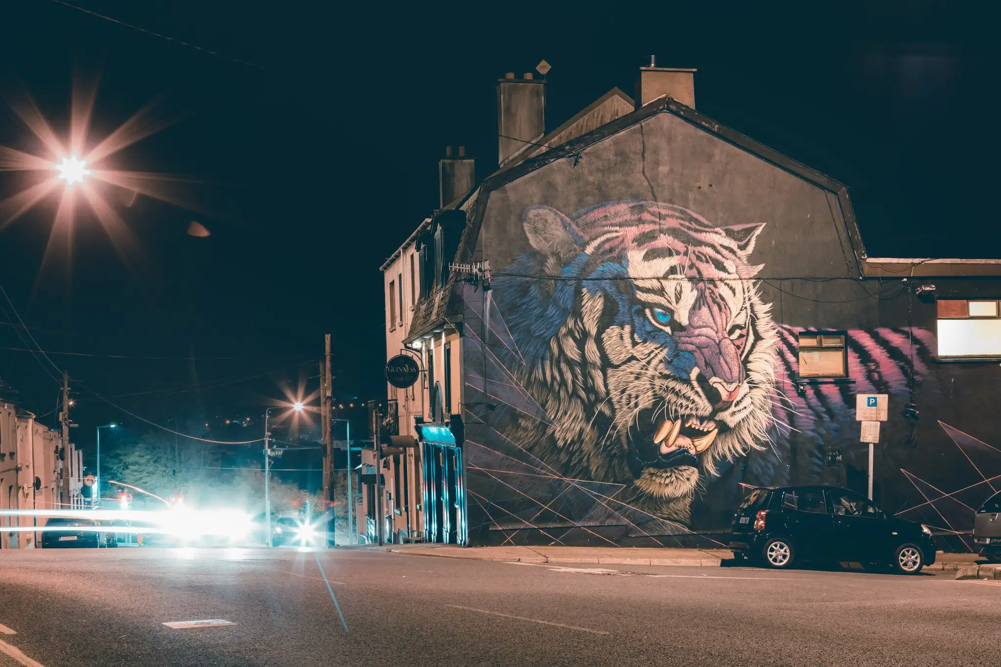
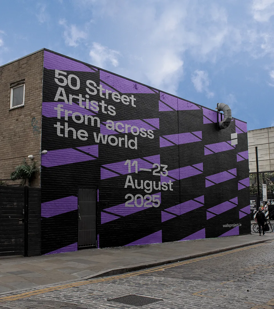
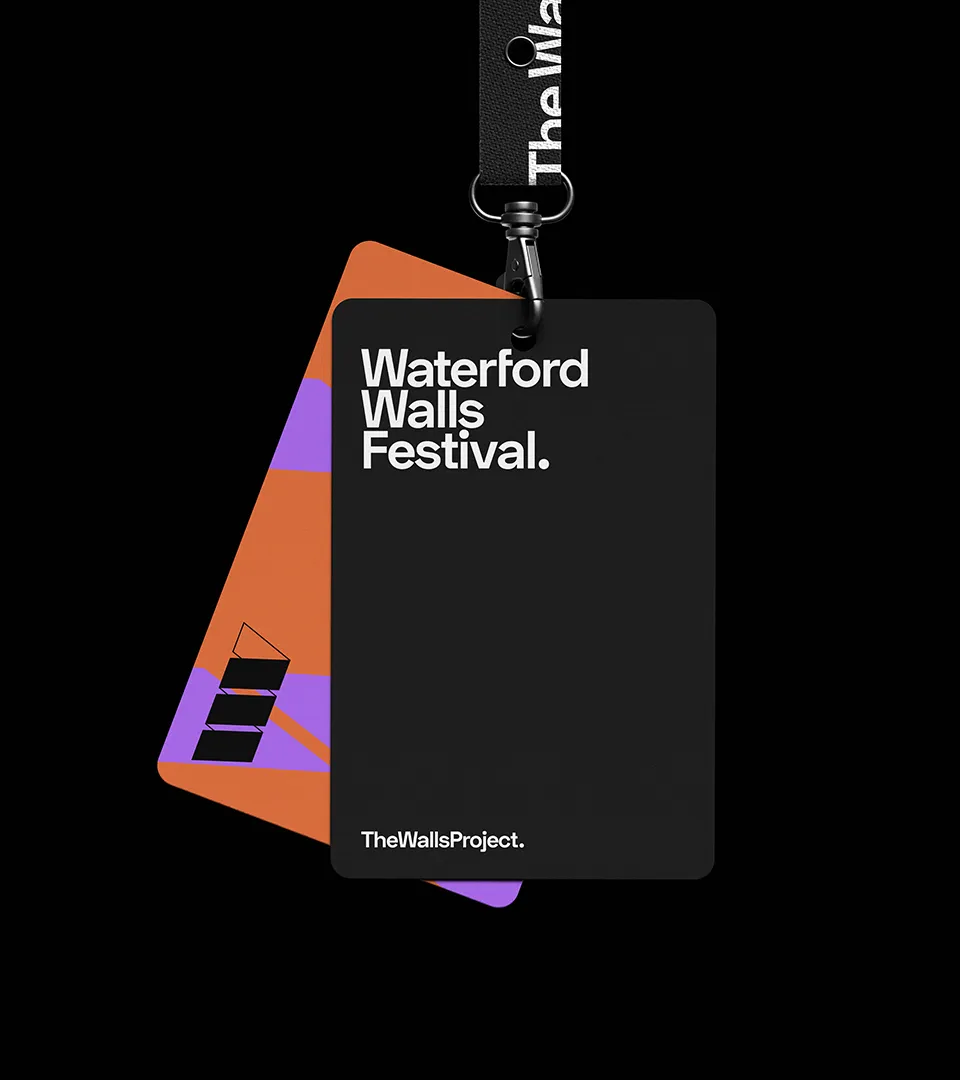
The Walls Project found themselves in the shadow of their flagship festival Waterford Walls. While they were proud of the success of the festival, their other streams – artistic exchanges, commissions and outreach programmes, were no longer visible. So we mapped out their organisational architecture – proposing a Monolithic structure with the Walls Project as parent. To make this work we suggested a unique logo and consistent identity for The Walls Project. Waterford Walls required a separate but related logo.


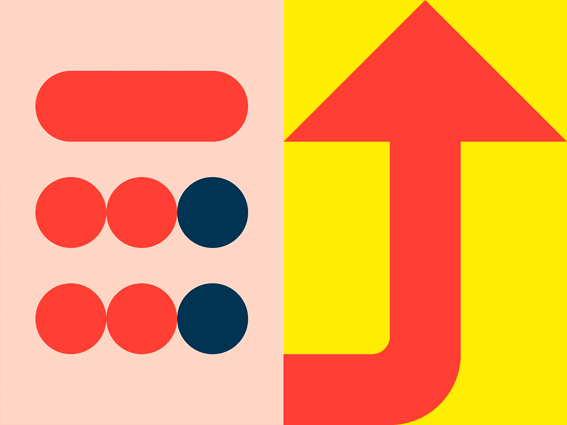
During an in-depth brand analysis workshop we uncovered the key characteristics of The Walls Project’s brand – community, the celebration of street art and connection. This influenced everything we did from there, from the tone of voice to the colourful, vibrant and adaptable visual language we developed. This brand was about building connected, creative communities.
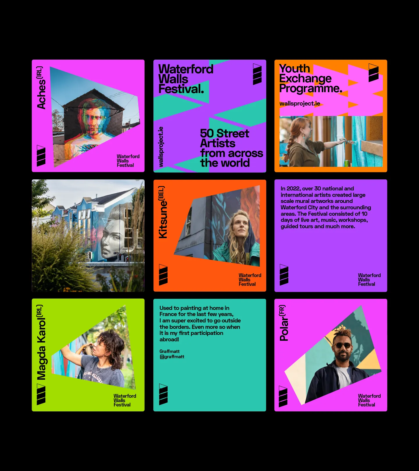
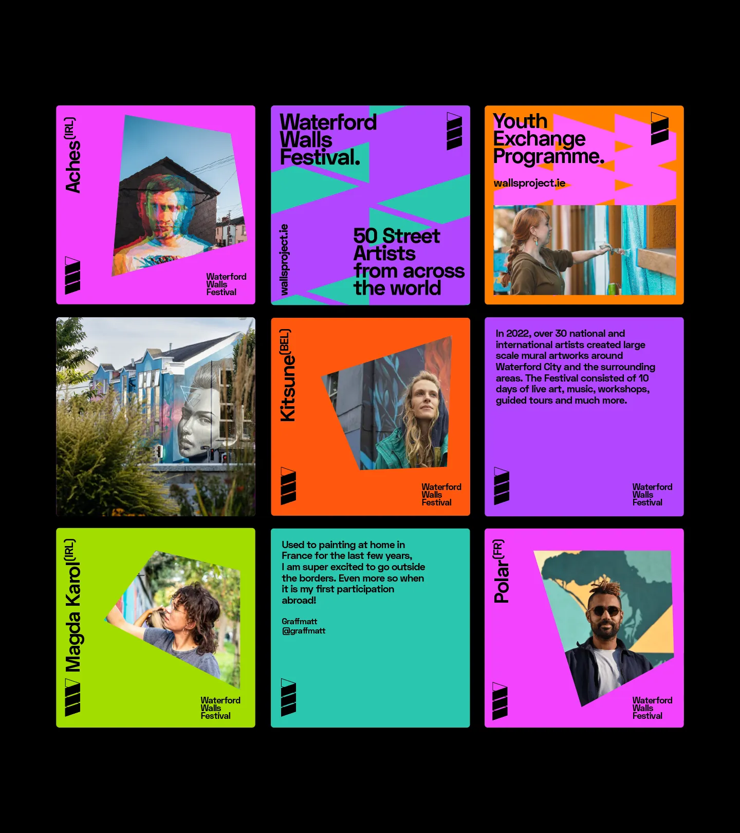
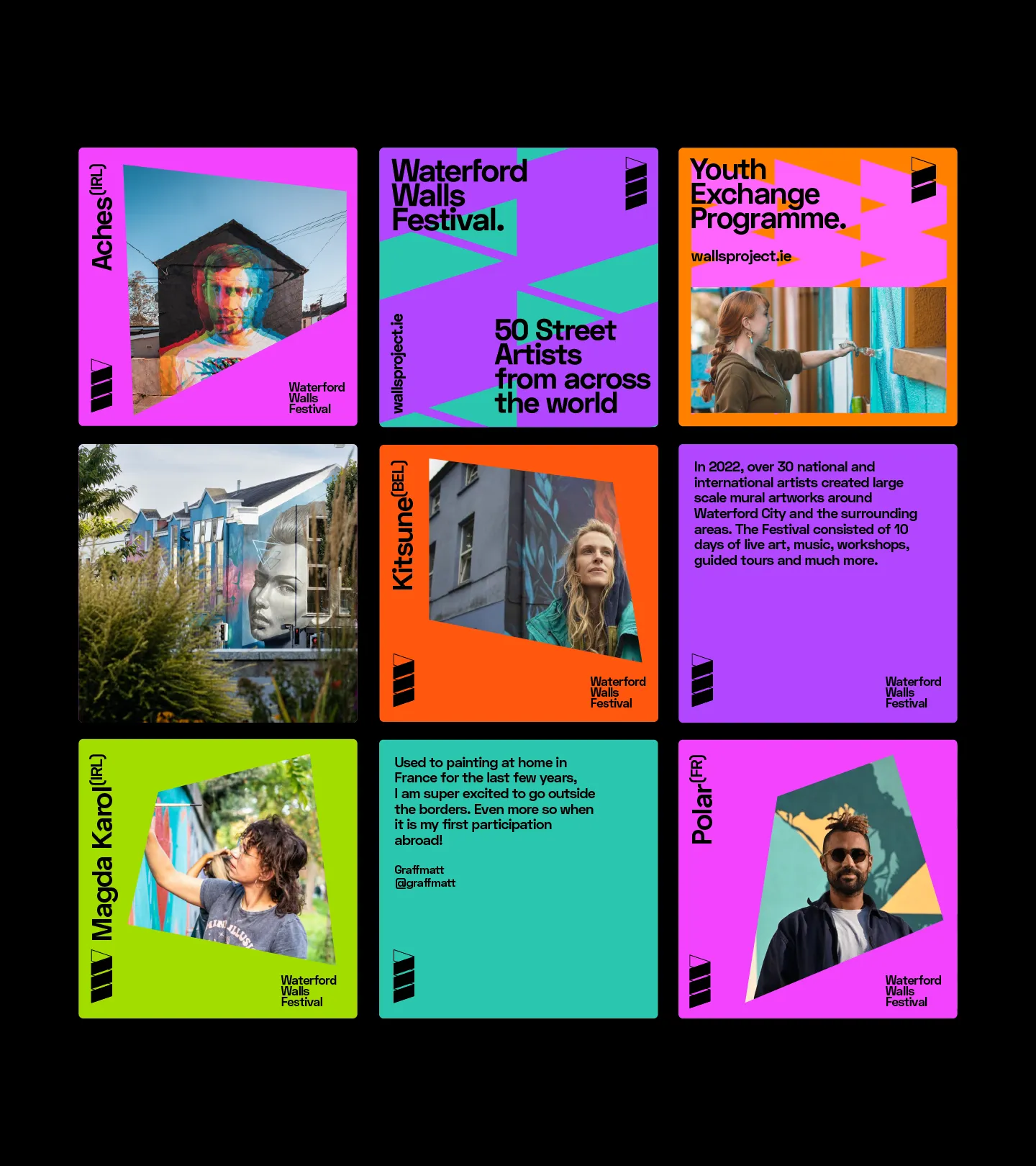
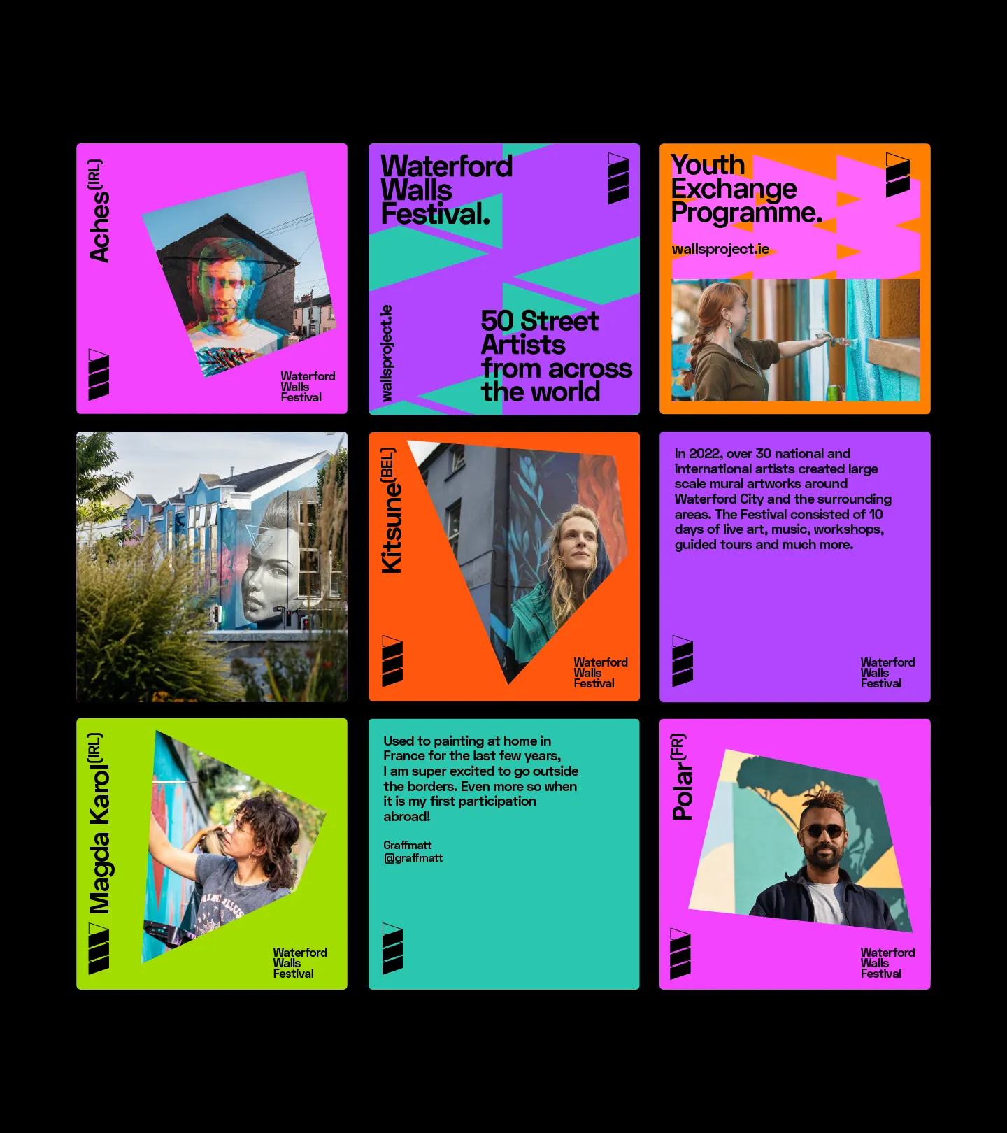
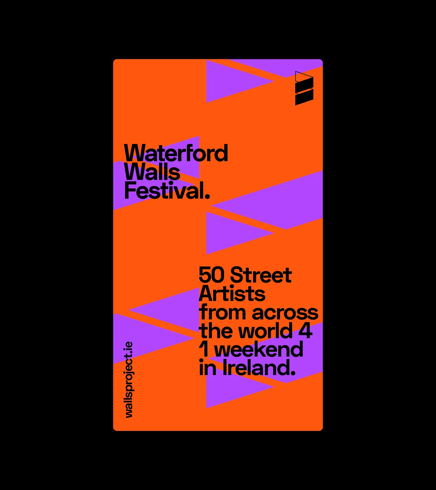
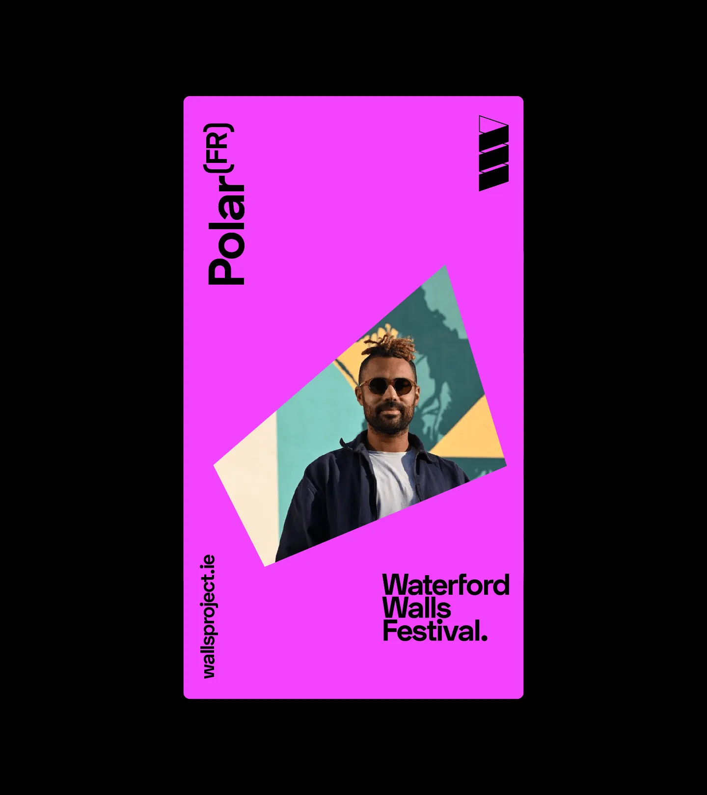
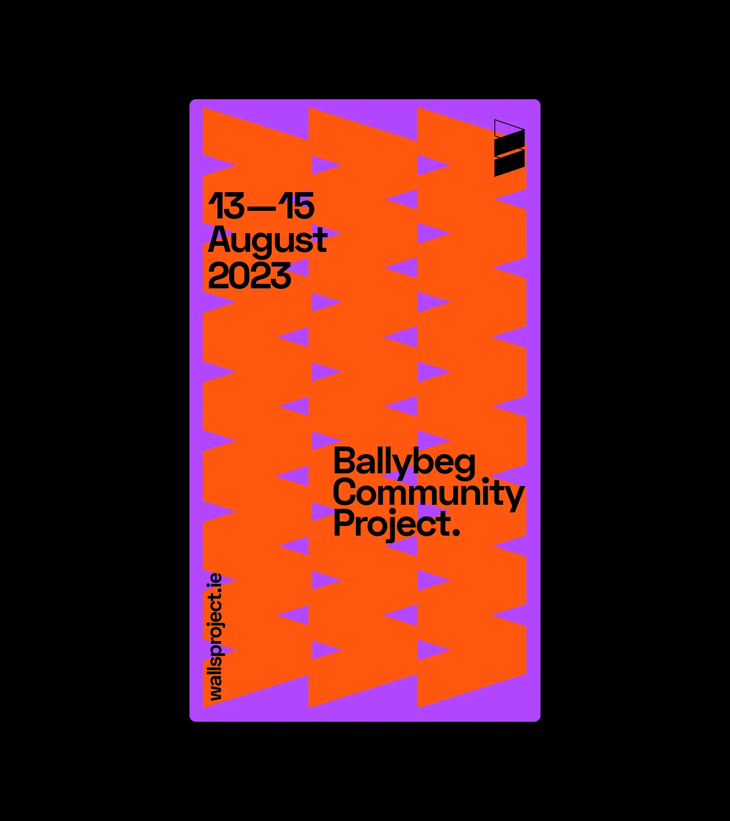
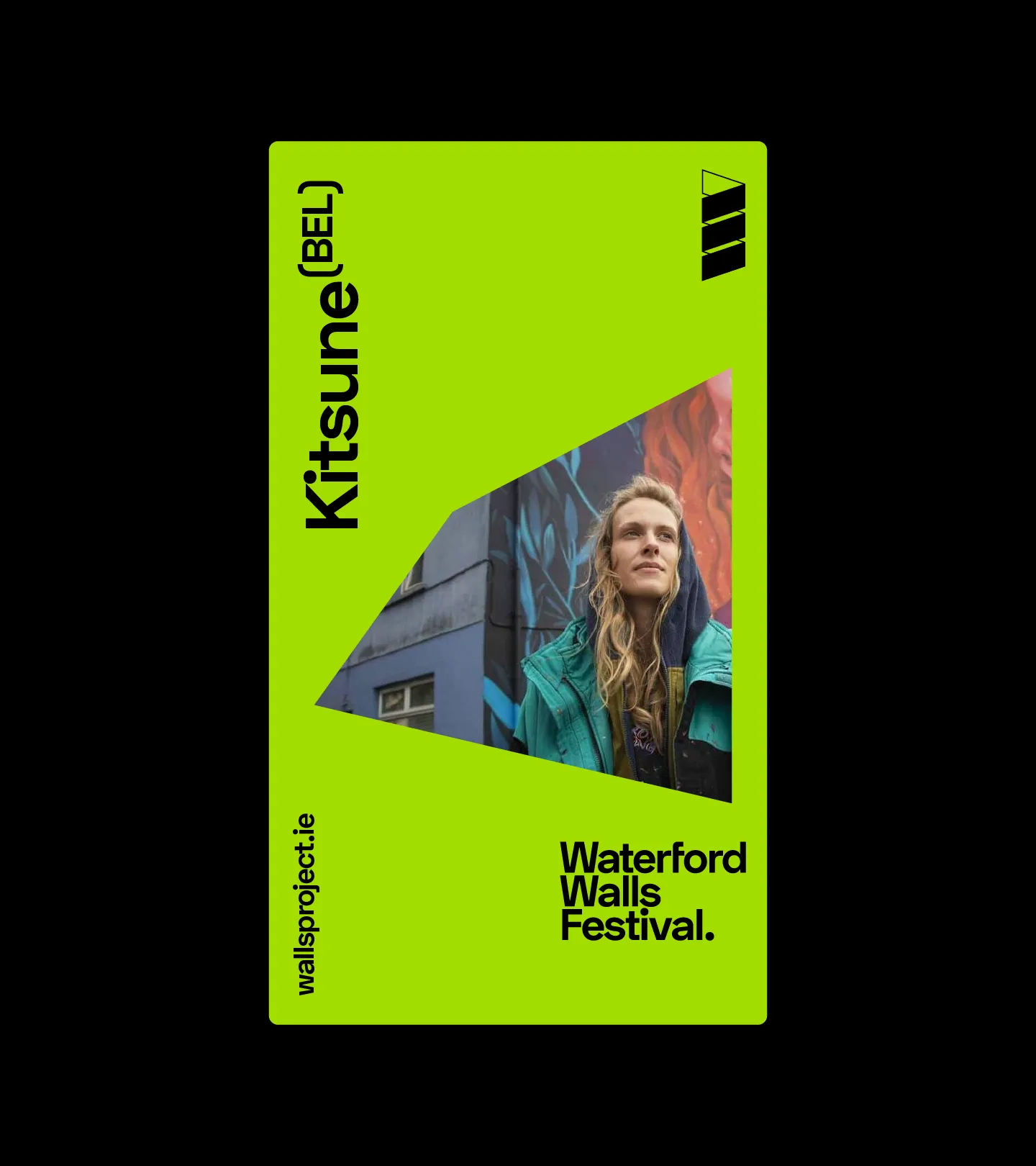
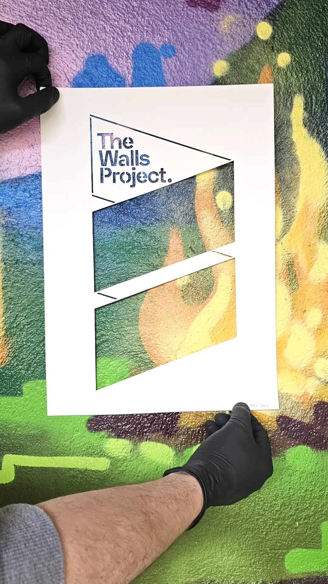
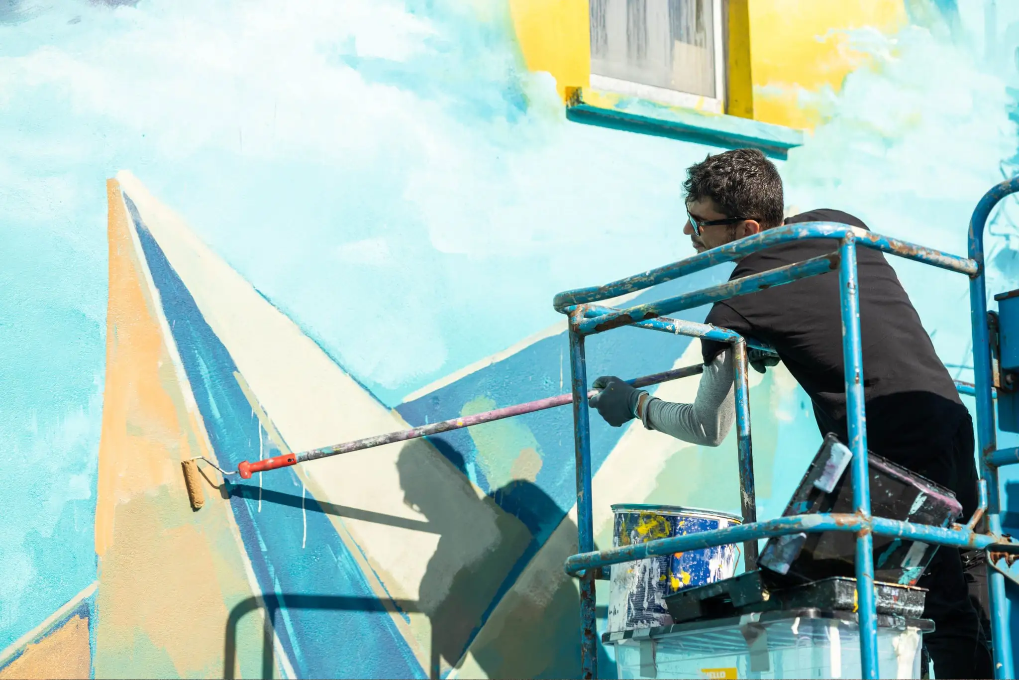
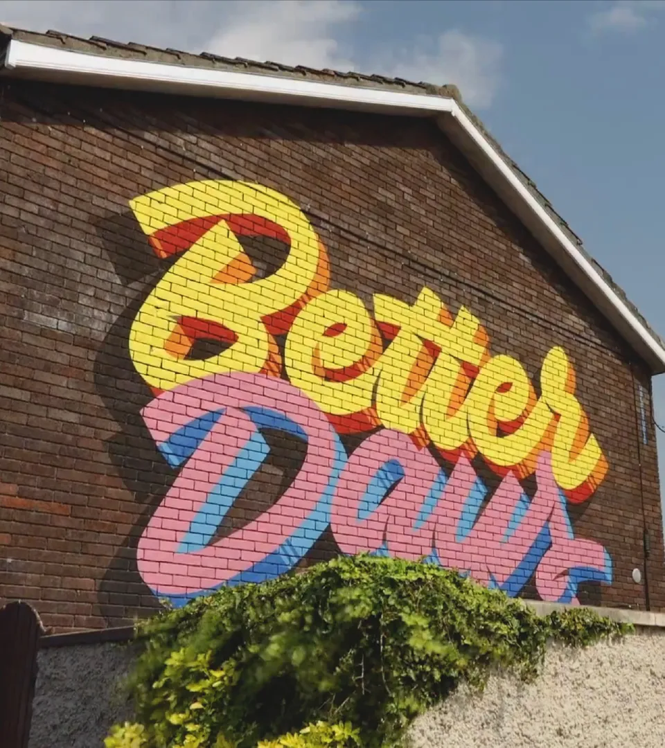
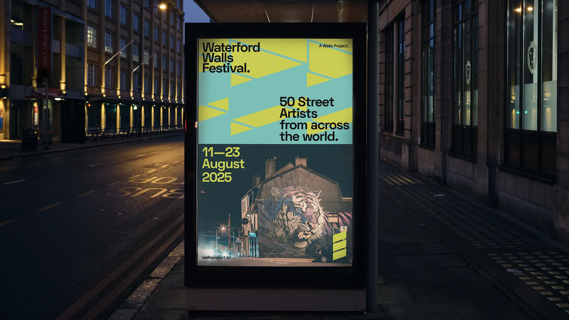
The reimagined brand embraced a restrained typographic expression with a condensed logotype that looks like tiered cityscapes and urban boundary walls. The symbol is a “W” on its side, adapted to look like the joining of two walls. Treated boldly with a palette of loud colours these symbols complement the extensive visual content The Walls Project share of commissioned artworks.

Comprehensive brand guidelines were developed to guide the implementation of the new identity across various print and digital platforms. A range of outputs, including print materials and digital assets, were created to support the team’s needs, ensuring consistency and adaptability.
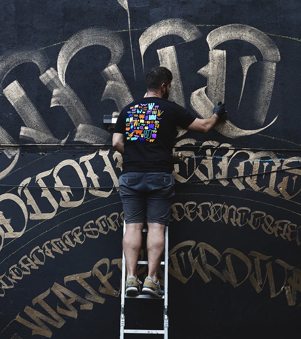
As a collaborative bonus, The Walls Project extended a special invitation to us, as artists, to design their annual Waterford Walls Festival t-shirt. Embracing the journey of the rebrand, the design celebrated the ‘unwanted W’s’ discovered during the exploration process and welcomed them into the festival’s attire and merchandise.
The reimagined brands for The Walls Project and Waterford Walls Festival embody the organisation’s core values and reflect their leadership position in the art community. The collaboration resulted in a cohesive visual identity, enhancing The Walls Project’s presence and impact in the community and beyond.
Reimagining the identities of both The Walls Project and Waterford Walls was a huge undertaking; with a complete rebrand that needed to hold space for two identities in one. Unthink rose to that challenge brilliantly. They took the time to really get to know us; who we are, what we value, and how our two identities connect and the result is a brand that feels not only true to us but also completely usable and adaptable in practice.
They did such a great job that we invited them to be part of the festival, with their ‘canvas’ becoming our 2023 festival t-shirt; a testament to their beautiful work and how deeply they understood us. What began as a working relationship has grown into a genuine friendship, and we’re grateful to have them as part of our extended community.