Crafting the Future of Public Spaces
A super slick, steely brand and website for OMOS – master crafters of street furniture and public spaces.
Built to last
OMOS are experienced makers of exquisitely designed, robust furniture who sought a brand that was equally considered. It needed to embody their precision, innovation and sustainability values and be as adaptable as the products themselves, able to inhabit both print and digital spaces with confidence.
Precision meets practicality
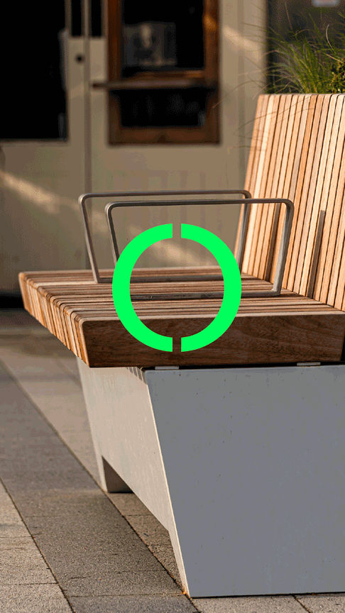
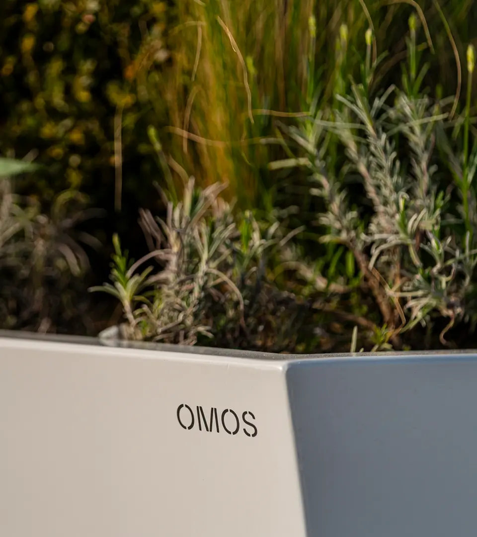
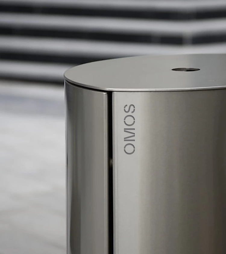
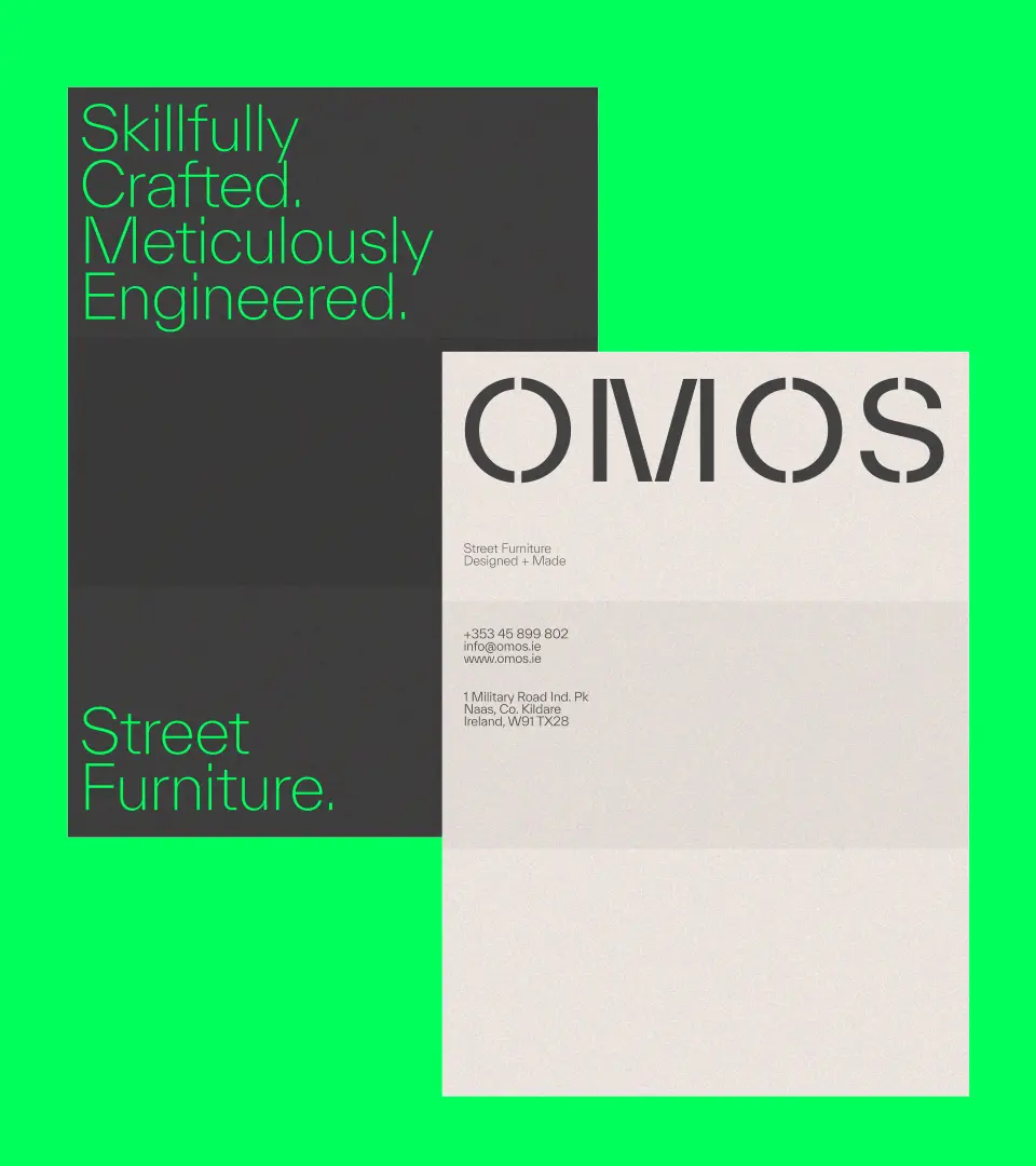
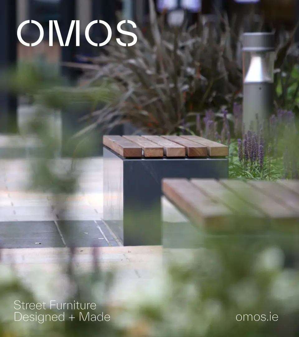
Inspired by OMOS’ product finishes, we created a stencil-style typographic mark that could be stamped, sprayed, or applied across materials like timber and metal. Working with typographer Bobby Tannam, we customised a smart sans-serif typeface with refined open joins to give the brand a distinctive, modern edge. The result is bold yet considered – an identity that feels both industrial and confident, elevated by a refreshed green palette that positions OMOS as a design leader.


Standardising & showcasing
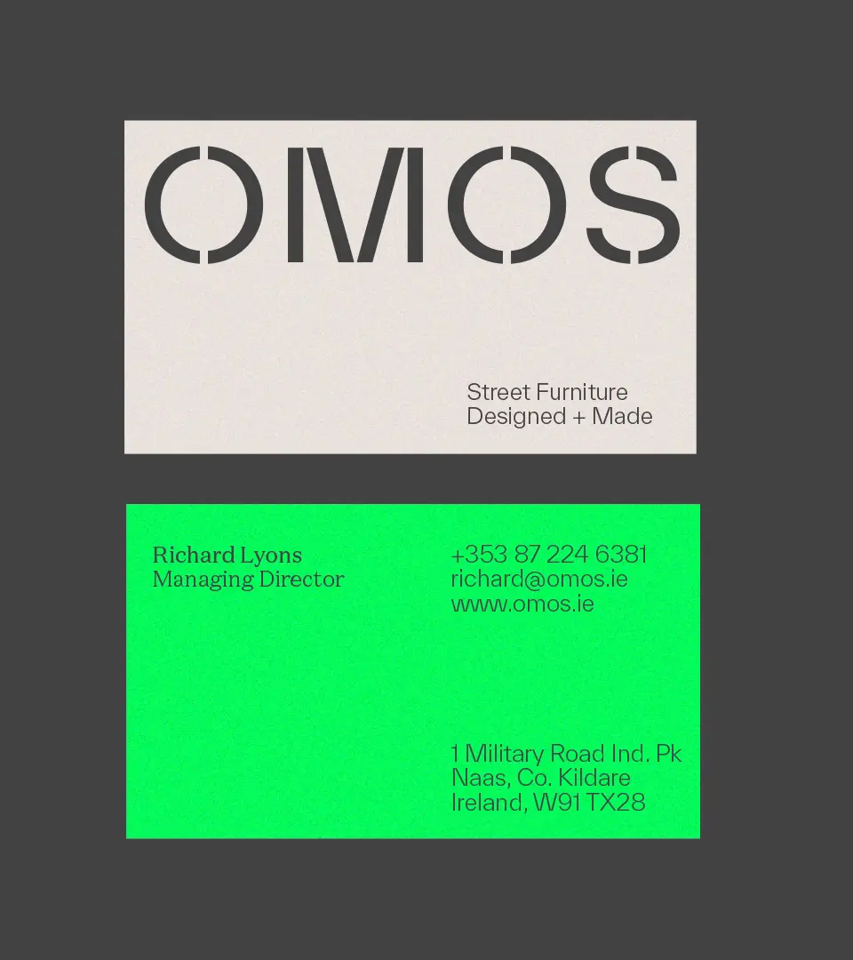
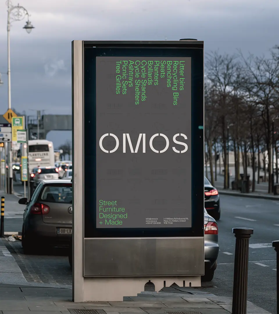
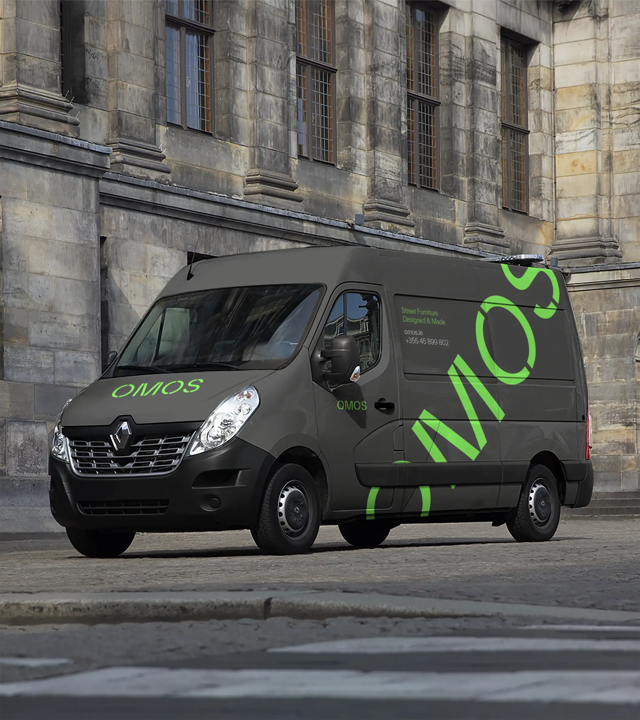
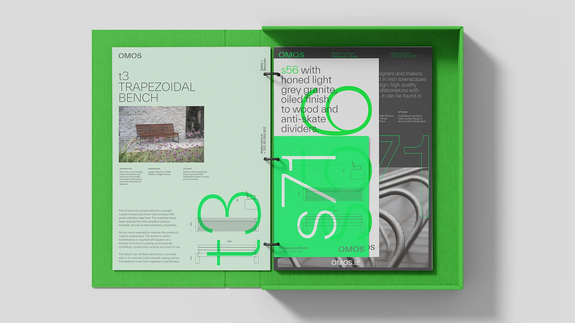
While still settling into their newly defined identity, we helped OMOS to fully adopt their new look by refining their product portfolio and standardising their specification drawings. The brand was also applied to stationery, van livery and marketing materials creating a cohesive visual language that reflects their commitment to high-quality, durable design.


The redesigned website was built to serve both aesthetic and practical needs. It showcases OMOS’ diverse product range with detailed technical information for architects and urban planners while also offering long-form case studies that highlight their national and international experience. An insights section was introduced to create opportunities for thought leadership, reinforcing OMOS’ role in shaping the future of public spaces.
Confident market leaders
OMOS are expert crafters, meticulous makers and design leaders. Their work inspired ours and the resulting, future-proofed identity has strengthened their market presence and positioned them as trusted partners for shaping public spaces with lasting impact. The website balances form and function and serves as a powerful tool for engaging architects, urban planners and specifiers.
Typographer
Photographer & Videographer