Positive Transformation
DCU is a young university that positively transforms lives and societies through cutting-edge learning and strong industry links.

Keeping Things Fresh
This was a brand refresh for an exciting new era of DCU. The university’s internal design team deliver daily communications to audiences across multiple departments and faculties, and needed a system that gave them the freedom to create fresh outputs day in and day out.
Modular Flexibility
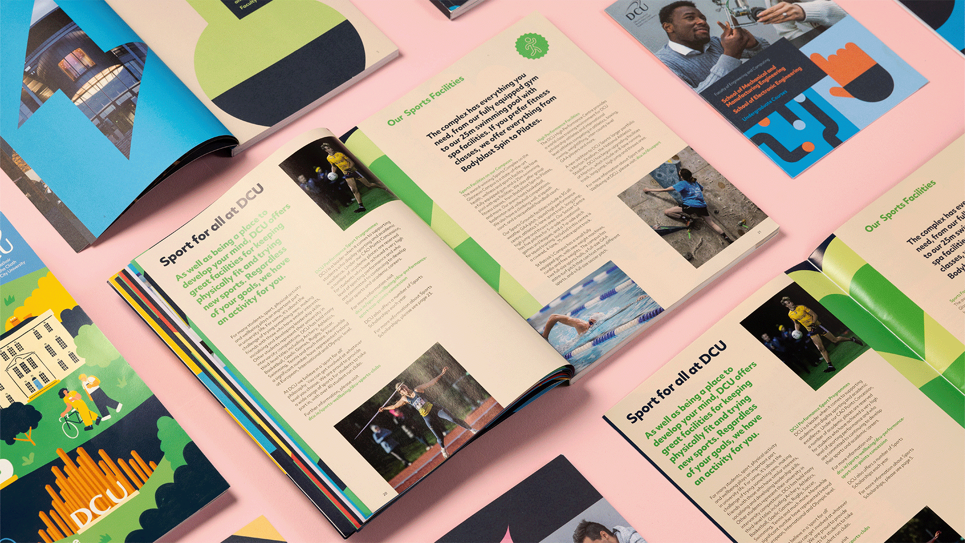
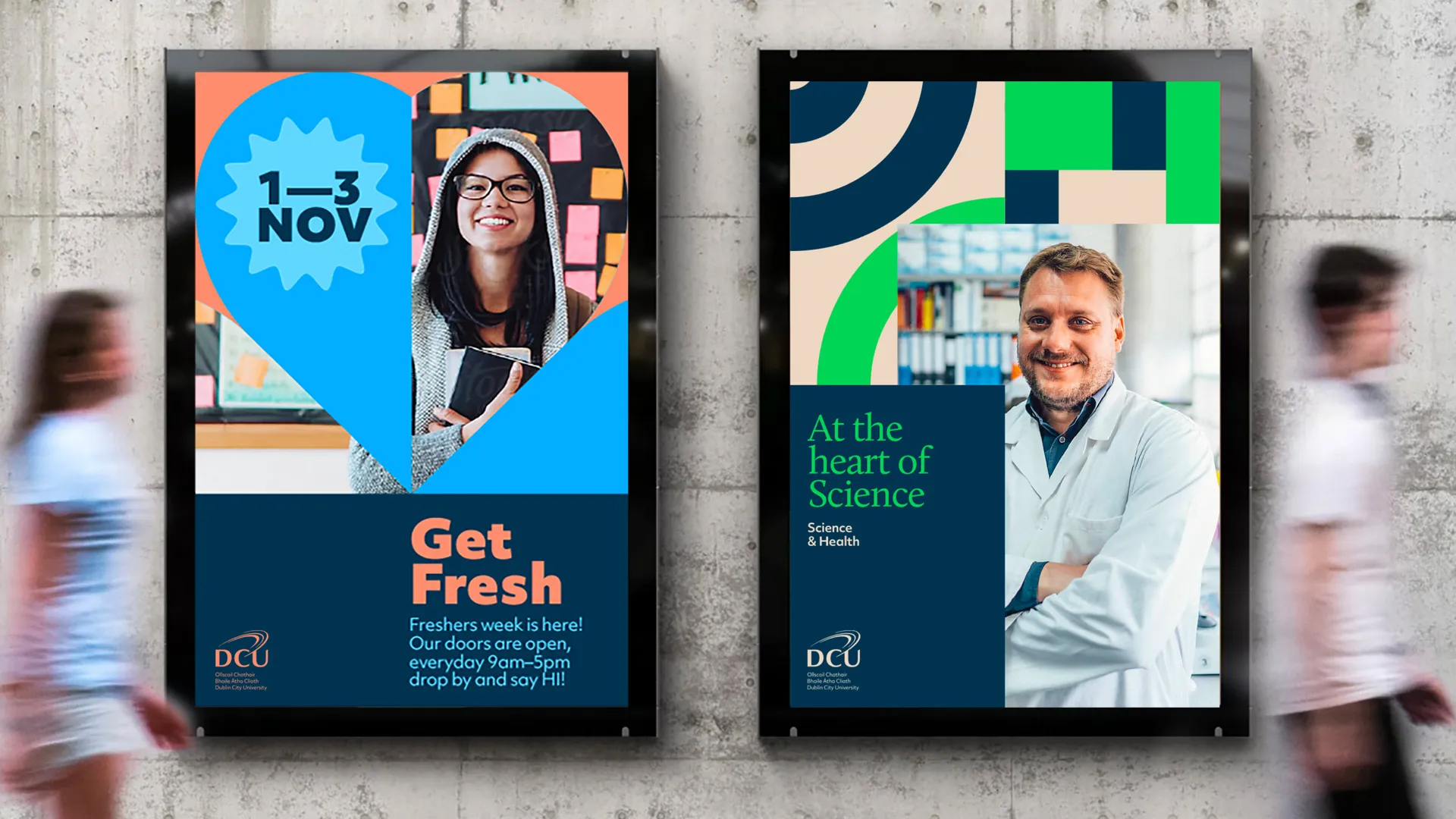
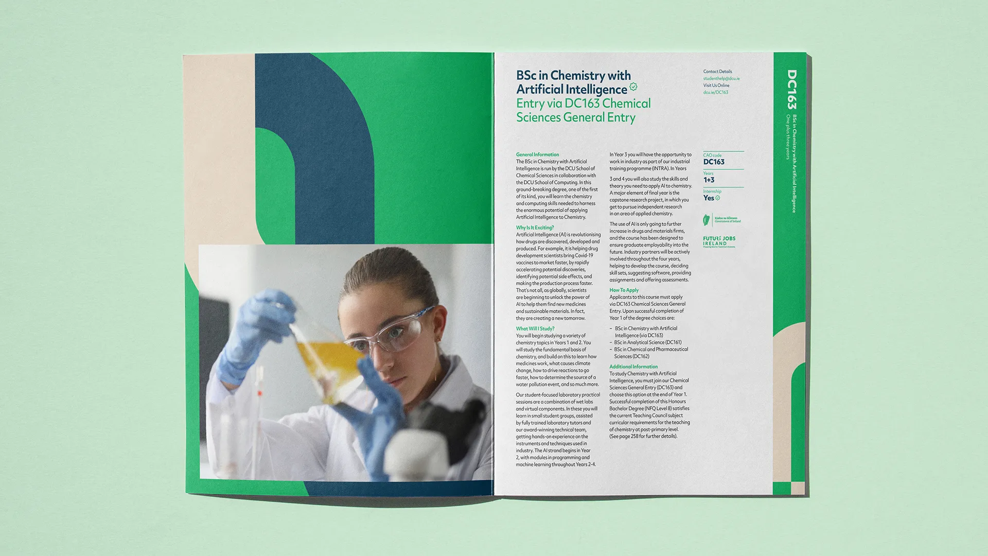
We proposed using colour and symbols to uniquely represent each faculty, giving the DCU designers endless combinations to play with. We wanted the design team to be able to alter the tone of their communications to suit specific audiences, and flex with the University as it adapts to new opportunities and media.


Structurally Sound
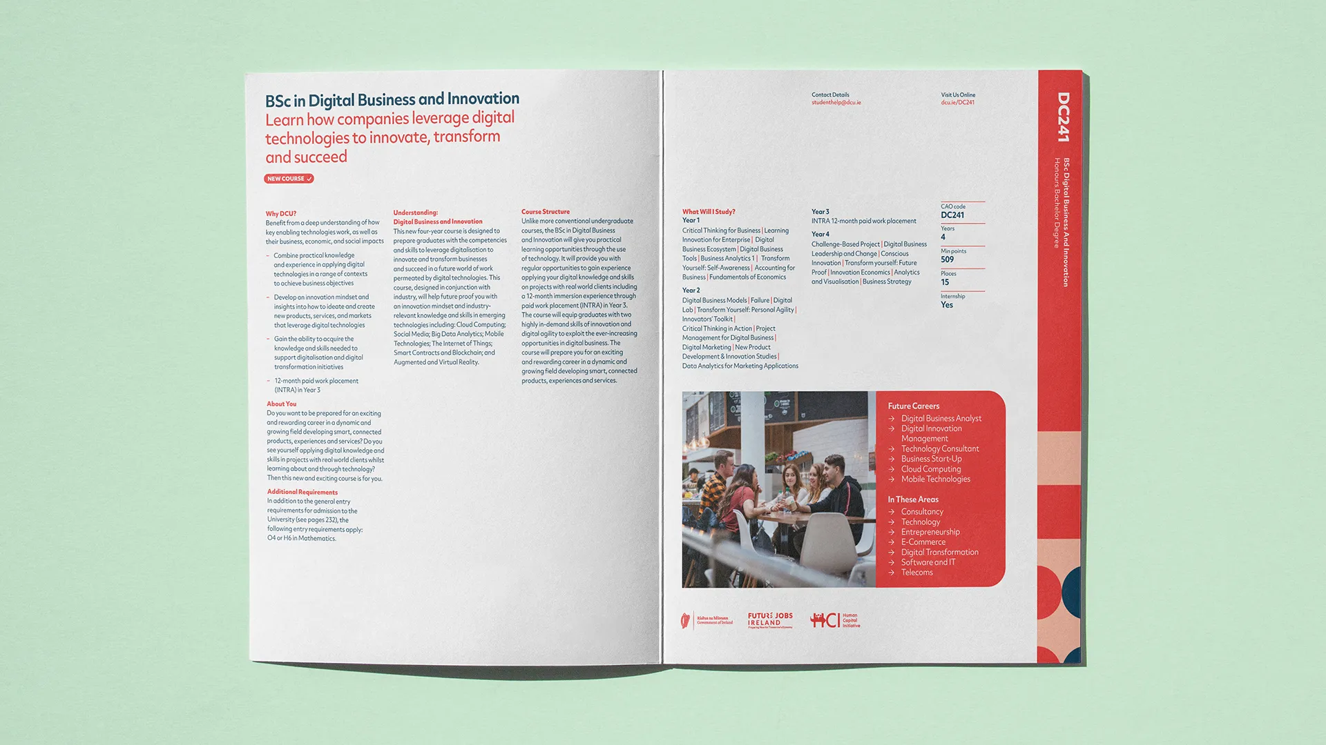
We developed a suite of symbols through collaborative workshops with each faculty and department. The symbols are arranged in interchangeable combinations forming the backbone of the pattern. Increasing the scale can shake things up and keep things looking different. These symbols and the accompanying colour palette make navigating between different faculties on the website, social media, and the prospectus easier.


DCU wanted to retain the main logomark, so we made some subtle adjustments to optimise the balance, improving its positioning when viewed alongside other university logos. We also kept their typeface but expanded it to include a serif, providing opportunities to broaden the tone of their communications.
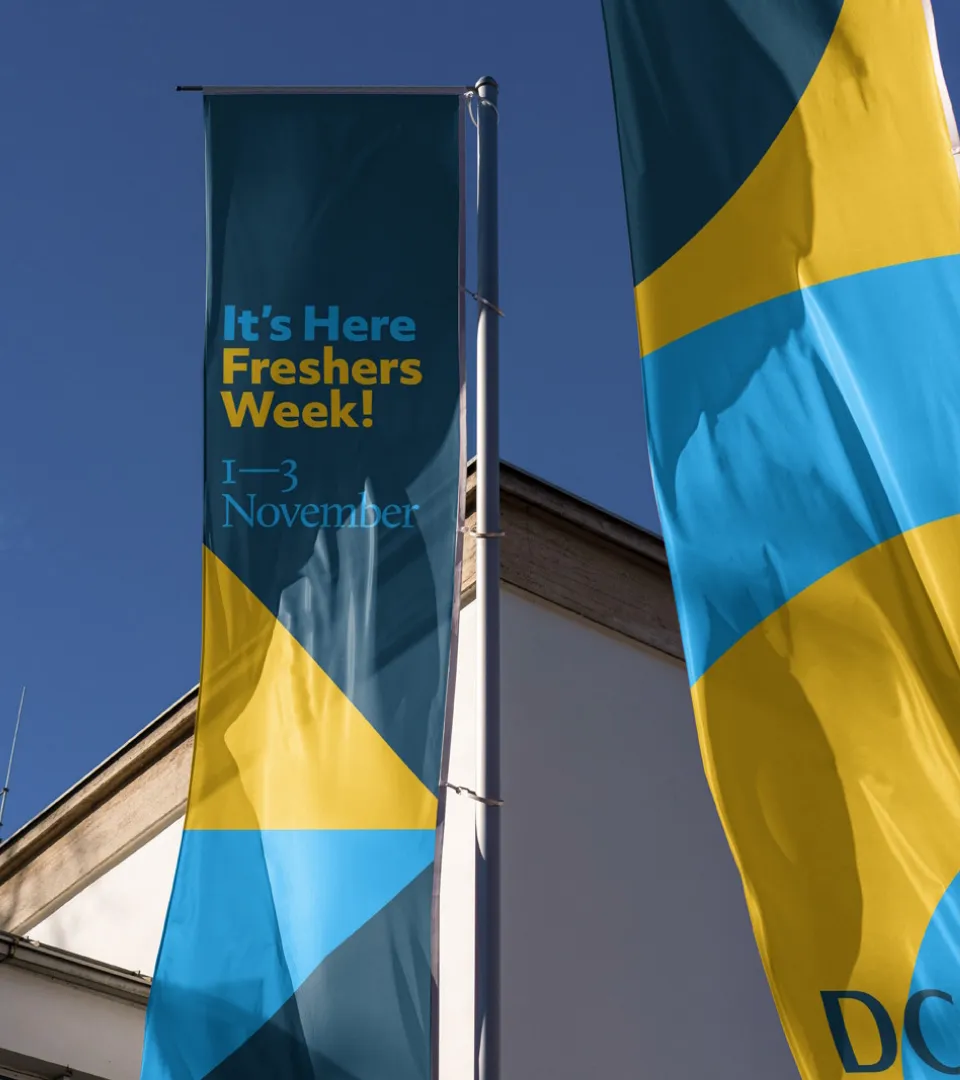
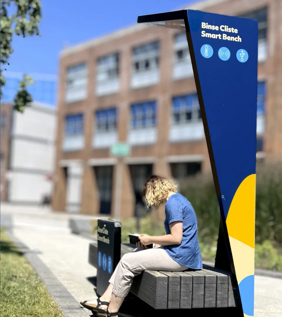
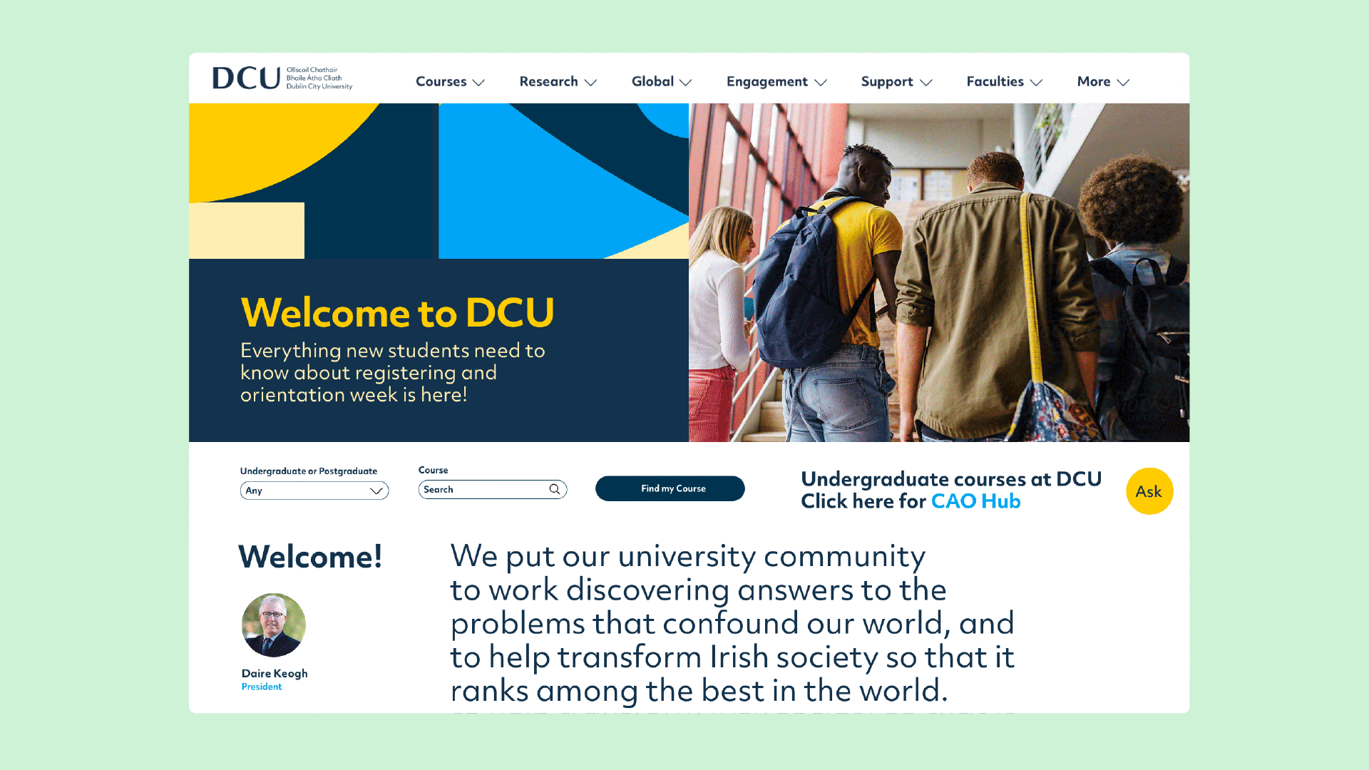
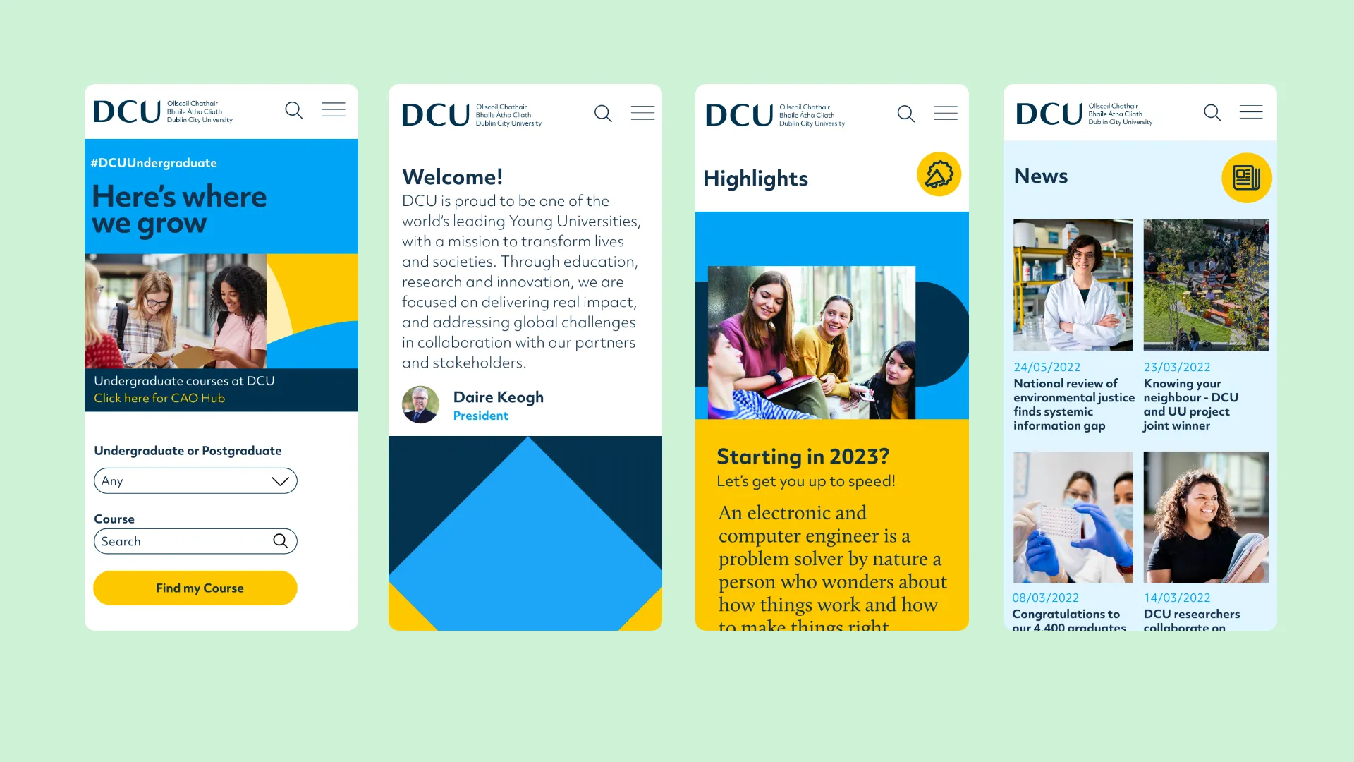
The online brand guidelines are a game changer, always online and easy to update, they build brand awareness and simplify the distribution of assets. The brand has been effectively deployed across print and digital and will continue to evolve online and on campus.
Positive Transformation
The rebrand positions DCU as a world-class, forward-thinking, and energetic University focused on positive transformation. The brand system allowed the internal graphic design and digital communications teams the freedom to be creative within wider parameters.
DCU