For the Love of Art
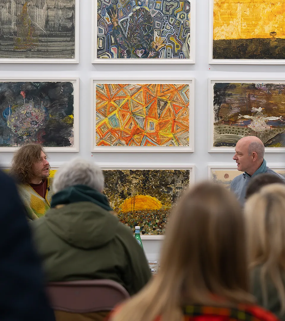
The Contemporary Art Gallery Association (CAGA) are a group of deep-rooted, like-minded Dublin galleries that want to make commercial art accessible to a wider audience.

A Balancing Act
The commercial art sector can seem intimidating to those unfamiliar with it. CAGA asked us to develop a brand identity which would address these perceptions and bring private galleries into public view.
Initially made up of eleven participating galleries, CAGA asked us to be mindful that their membership would continue to grow. While it was important to represent the association, we had to be careful to avoid alienating potential new members.
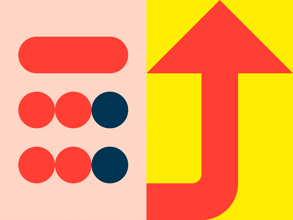
Shaping and Morphing
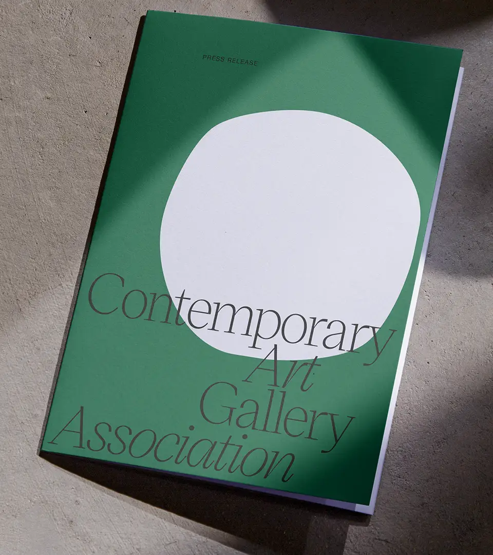
Simplicity and integrity were the primary pillars used to steer the brand’s direction. We kept things abstract and considered ways to represent the dynamism of a multi-member association. The identity symbol morphs from a square to a circle – echoing the ‘white box’ space and the familiar dot denoting a sold artwork. Throughout the transition, in-between shapes are formed which can embody the association’s growing members.
Always Responding
The colour palette needed to be bold to capture a new audience and sophisticated to reflect its members. We strengthened earthy tones to find the right balance, bearing in mind that the colours chosen would also need to complement art imagery.
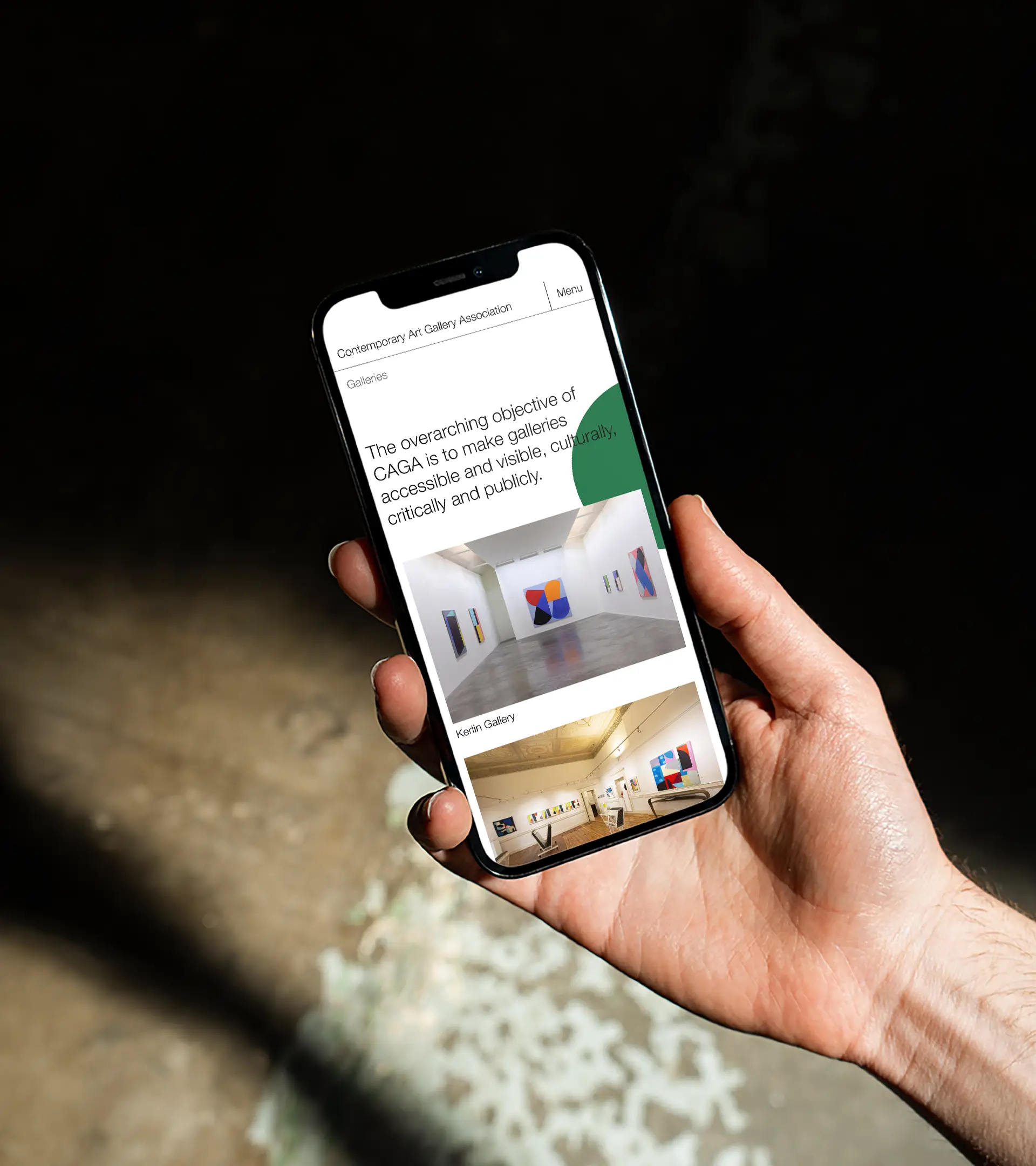
The typefaces are classical, but the typographic mark shows a willingness to adapt. It hugs the boundaries of the screen or page it finds itself on, mimicking how art responds to the gallery space and vice versa.
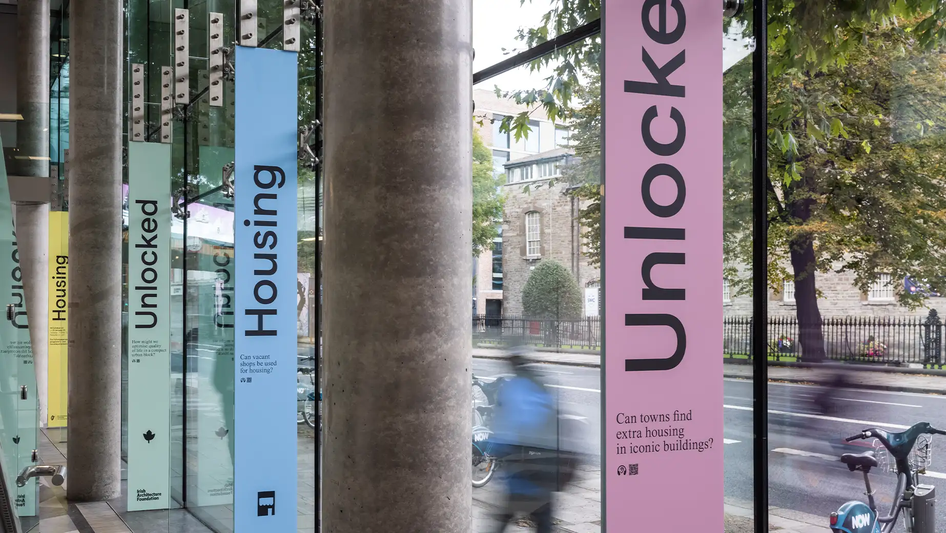
The website embraces simplicity through clean design and intuitive functionality. A restrained colour palette lets the artwork lead, while responsive typography hugs the edges of the screen, echoing the framed nature of gallery spaces. Each year, it expands to host a dedicated Dublin Gallery Weekend hub, transforming into an events-focused platform.
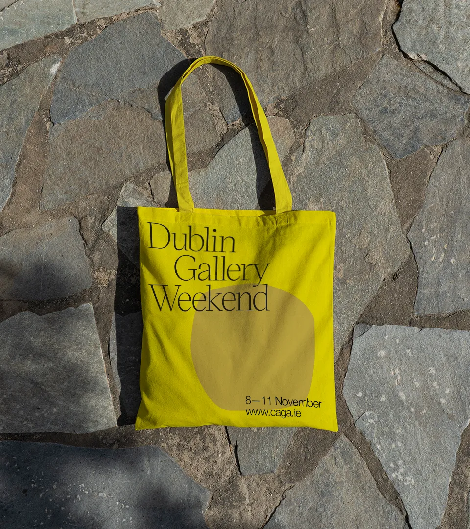
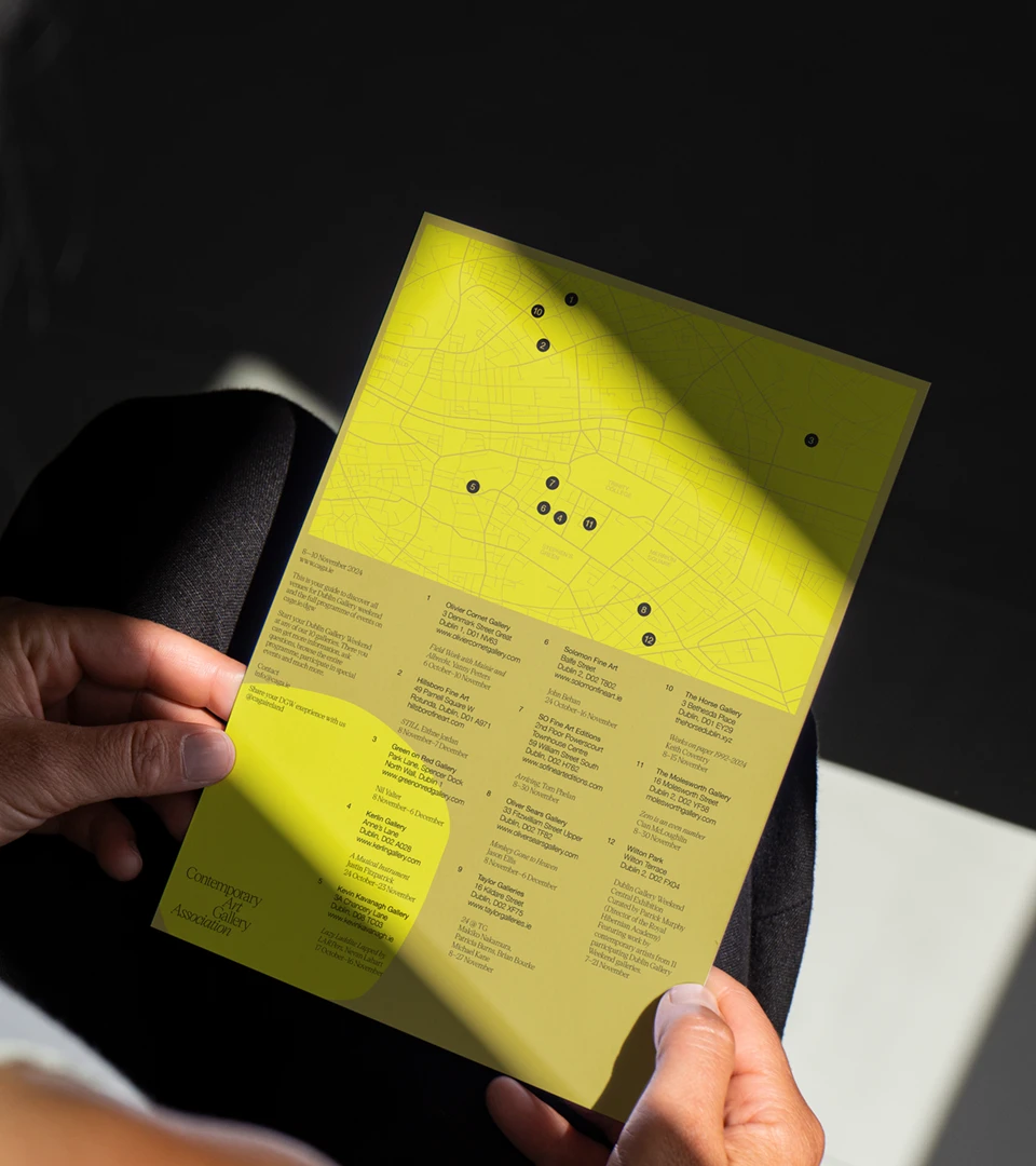
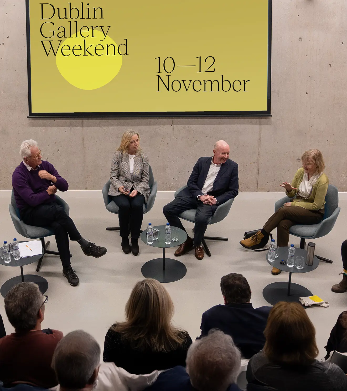
In November 2023, CAGA hosted their first Dublin Gallery Weekend. The event included late exhibition openings, talks, walks and tours, all intended to welcome the public into participating galleries. As their largest event to date, having a strong visual affiliation between CAGA and the weekend was important to build awareness. So, we switched up the colour palette but kept the rest of the look and feel consistent with the main brand.
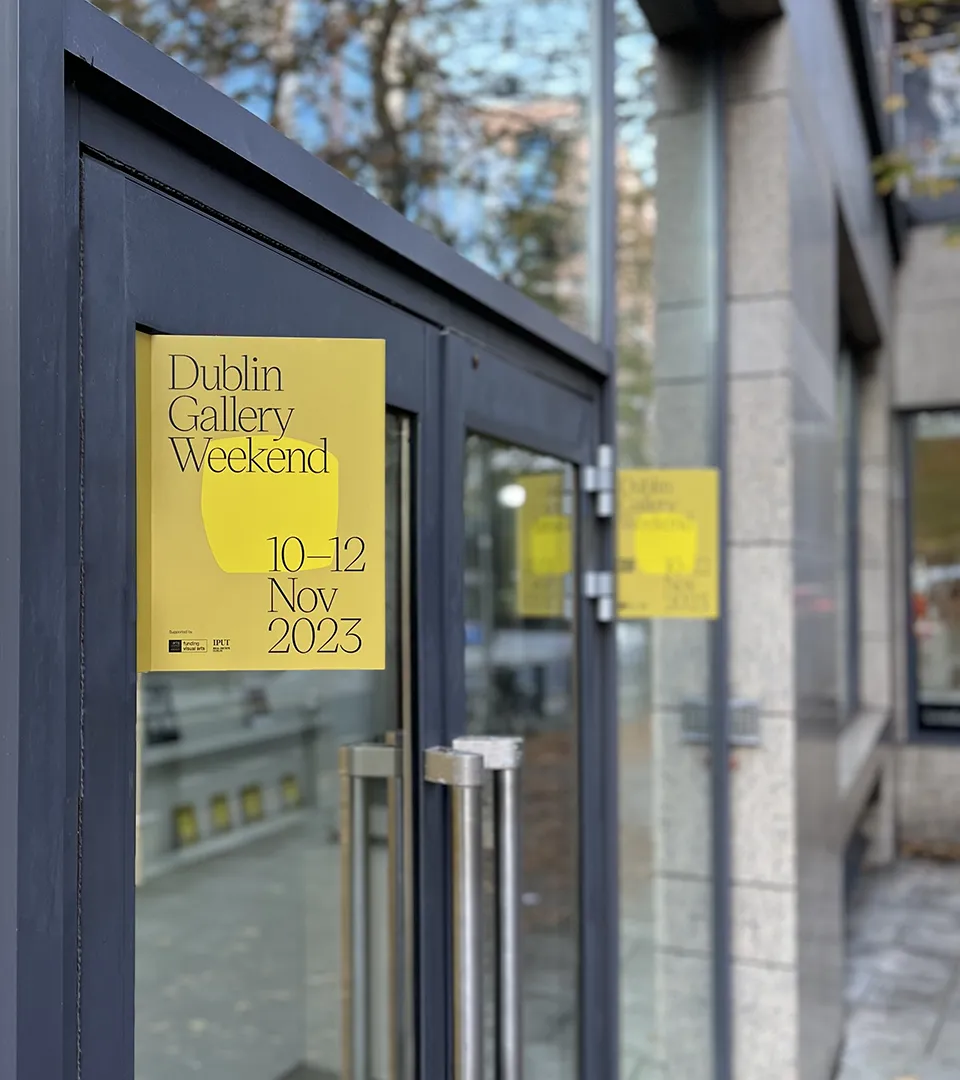
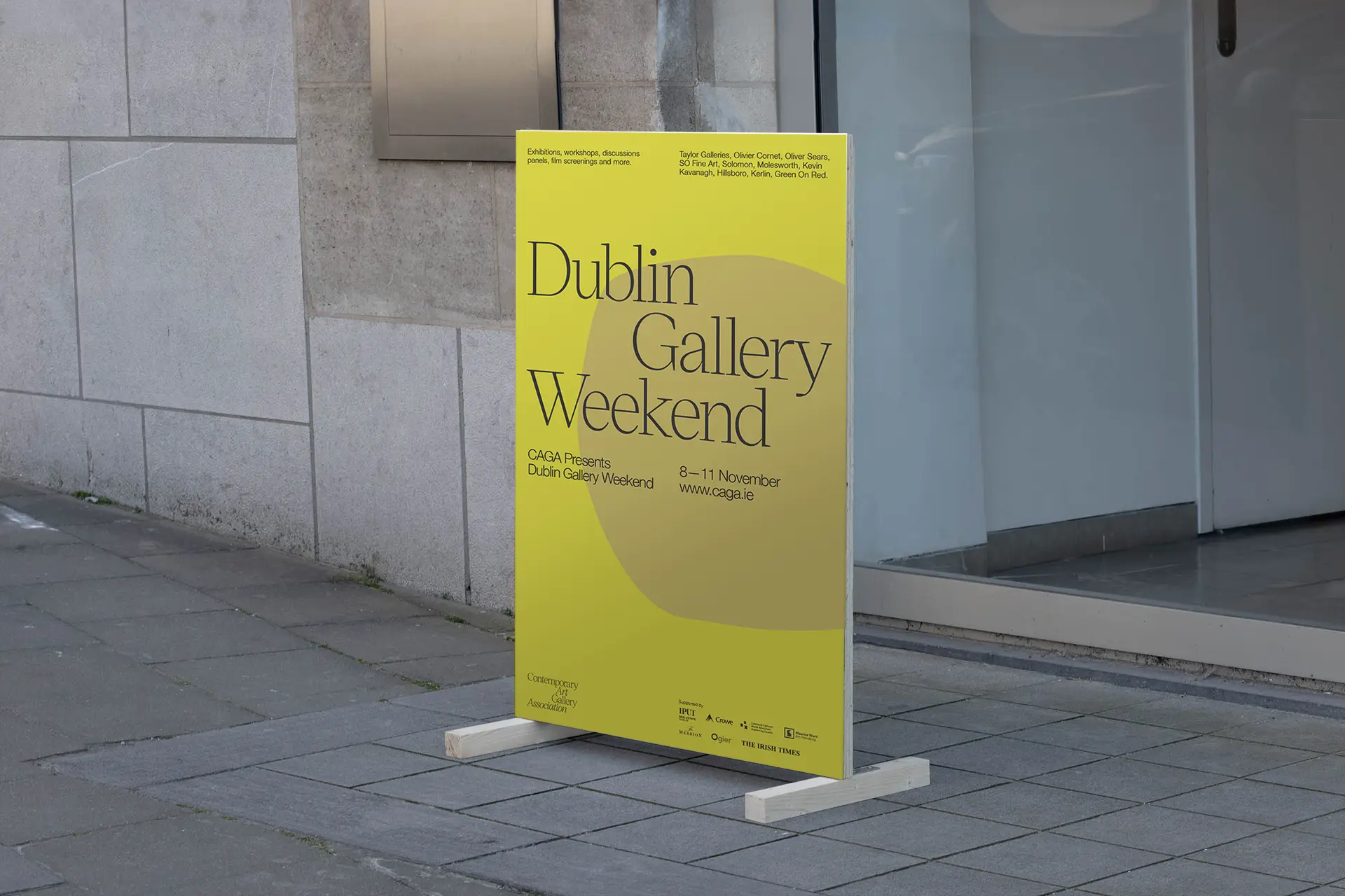
We designed signage, wayfinding, tote bags and social media posts to promote the event. We also integrated a new DGW subsection into the website to promote each individual event.
The CAGA brand identity brought visibility to the association and its members which is one of their primary objectives. The website and the social media system we created give them the tools to promote their activities and build their audience.
Feature Photo