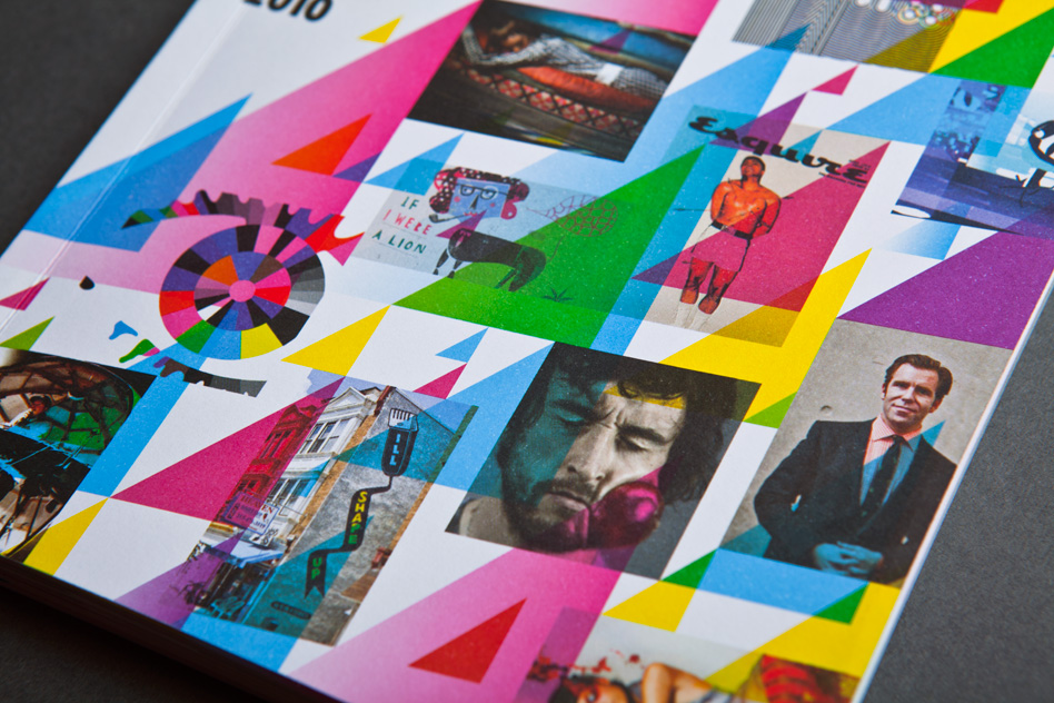
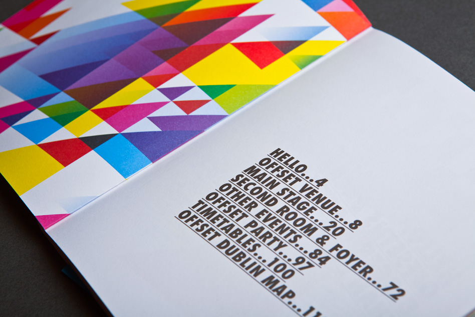
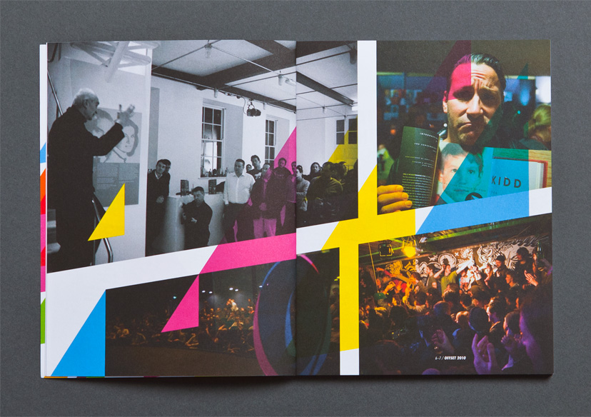
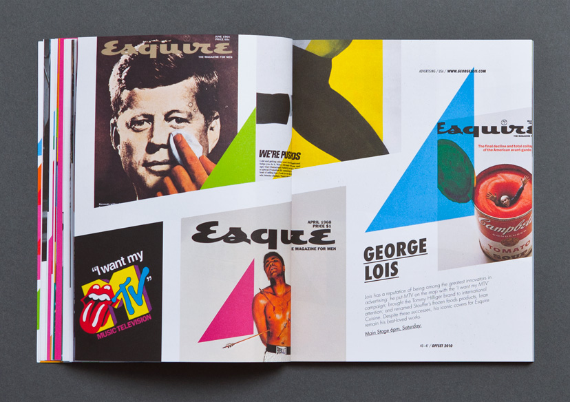
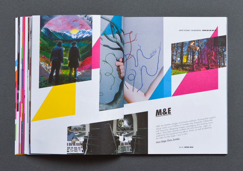
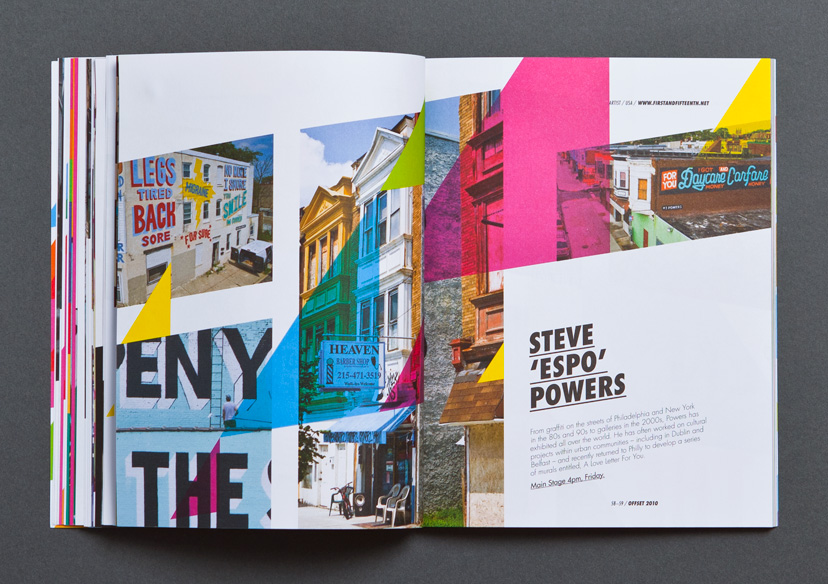
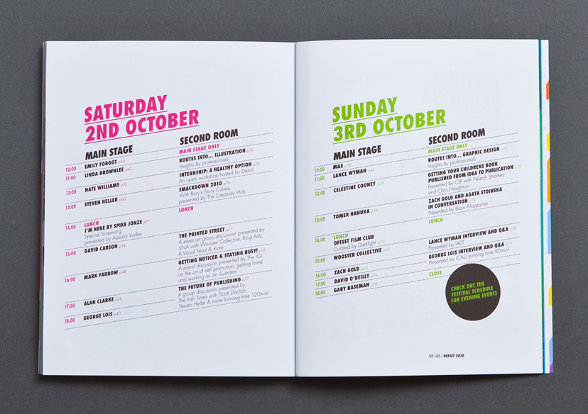
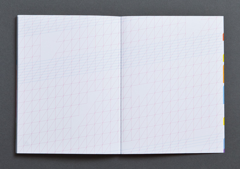
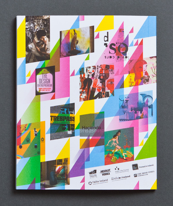
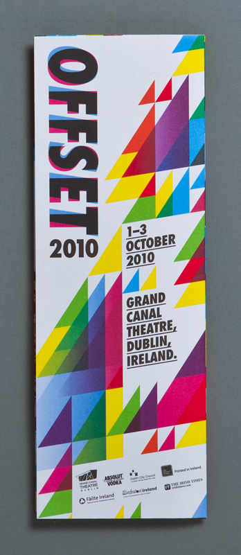
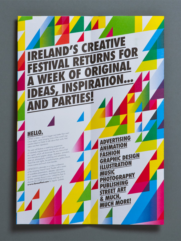
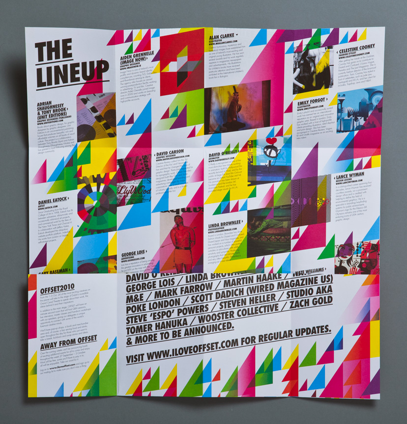
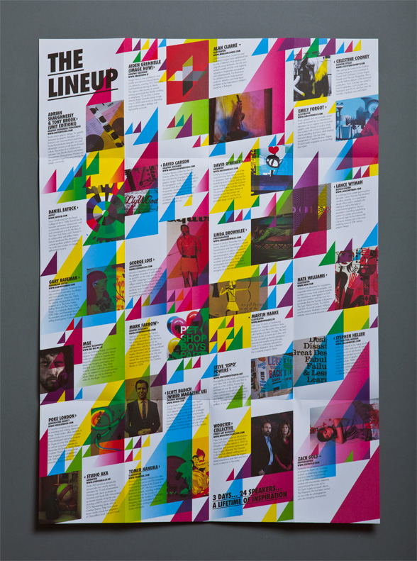
We were delighted when our good friends at OFFSET asked us to handle the creative for the 2010 conference – only in its second year, it was already getting huge attention in Ireland and abroad. And heaps of our design heros were going to be at it, getting up close and personal with our work. So no pressure then. We used the existing OFFSET logo as our starting point, and oriented everything on an italicised grid. The bright, anti-recession colours communicate the optimistic tone of the event.
Share This on Facebook / Twitter
